
4 ways maritime pros use charts, routes and ETAs on the same map
Ask ten maritime professionals what they need from a tracking platform and you'll get ten slightly different answers. A harbour pilot wants centimetre-level clearance data. A charterer wants a fast, defensible ETA. A port agent wants to know what's arriving in the next 72 hours. Different job, different question, same underlying need – a reliable, real-time picture of where vessels are, where they're going, and how long it will take them to get there.
Two features do most of the heavy lifting to fulfill these use cases within the MarineTraffic mobile app: nautical charts on the Live Map, and the Voyage Planner. Both are core operational tools for anyone whose job benefits from maritime intelligence. Below is a look at how different professional personas actually use them, and why.
What do nautical charts actually show?
Before getting into use cases, it's worth being precise about what a nautical chart layer adds that a standard map doesn't. On the MarineTraffic live map, switching to nautical charts renders navigable waters in the same dark blue palette used in traditional chartwork, with land shown in earth tones and sea in lighter blue for contrast against vessel icons and past track playback.
The layer includes:
- Bathymetry (water depth, measured in metres)
- Shoreline and seafloor features
- Hazards, including rocks and wrecks
- Aids to navigation, such as buoys and lighthouses
- Tidal and current information
- Special marks, anchorages and caution areas, using standard international and US chart symbology
This is meaningfully different from a light, dark, or satellite map, which are built for visual clarity and general orientation rather than course plotting.
What does the voyage planner actually calculate?
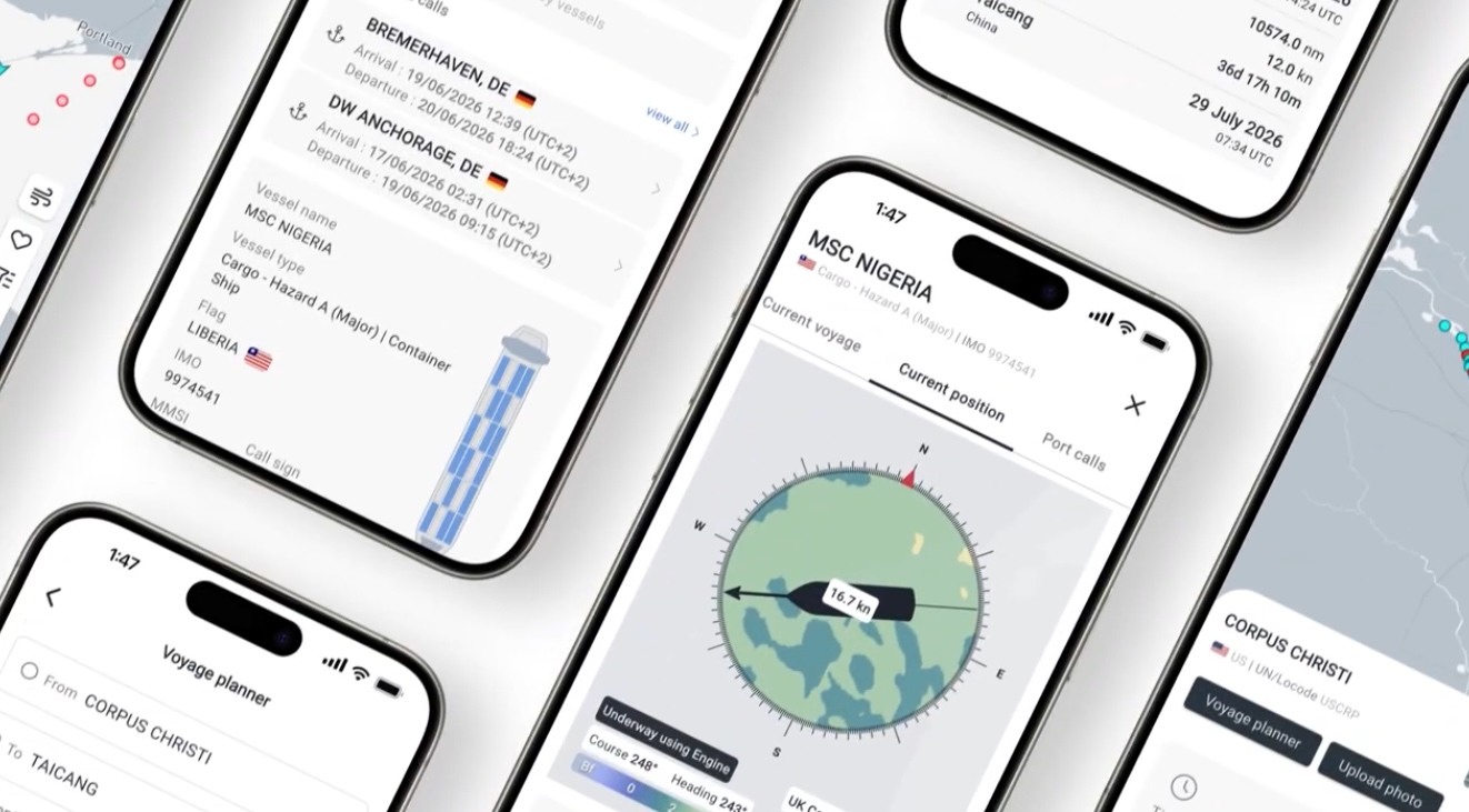
The MarineTraffic voyage planner estimates transit time, distance, and route for a vessel across a single leg or a multi-leg journey. The workflow is straightforward:
- Set an origin. This can be a port, a vessel, a point selected directly on the map, or your current device location.
- Set a destination, and add intermediate leg destinations for multi-stop voyages (for example, Lisbon to Rotterdam to Helsinki).
- Adjust voyage parameters, including estimated time of departure, timezone (UTC, local device time, or the departure port's local time), and planned speed.
- Choose canal and passage avoidance, toggling off the Suez Canal, Panama Canal, Kiel Canal, Arctic Passage, or inland waterways as needed.
- Calculate the route to generate an estimated time and path.
The output is a defensible, adjustable estimate that accounts for real routing constraints, not just a straight-line distance calculation.

See why the most successful traders and shipping experts use Kpler
Vessel tracking for maritime pros